



IMD Texture & Color Design Tips: Get Rid of Cheap Plastic Appearance
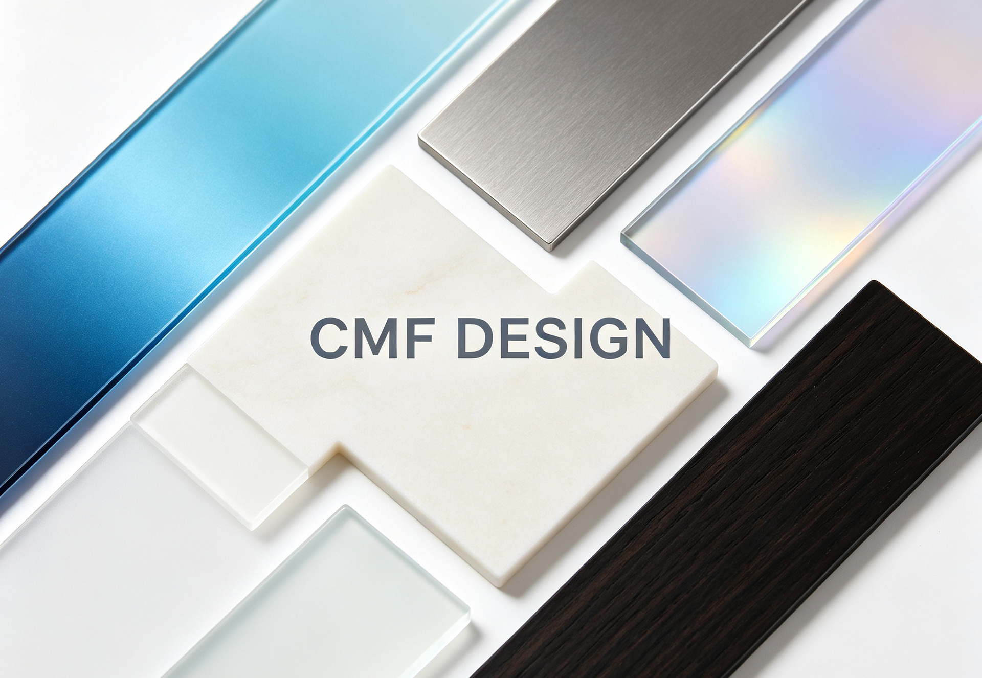
Even with IMD technology adopted, finished products often show inconsistent quality. Some feature premium texture, transparent colors and three-dimensional delicate textures, while others suffer from dull gray tones, blurry grains, pattern distortion and messy details. In fact, the upper limit of IMD product appearance depends not on equipment, but on preliminary CMF design and process adaptation details. Below are four core design tips to maximize the texture and color advantages of IMD.
1. Texture Design: Avoid Full Paving and Follow Curved Surface Stress Distribution
IMD’s greatest strength lies in its ability to reproduce high-precision complex textures, but blind full-surface texture paving should be avoided in design. Priority shall be given to avoiding product edges, thin walls and high-stress areas, where tensile deformation is most severe during injection molding, easily causing texture stretching distortion, grain warping and local whitening, which seriously undermines the overall texture.
Pattern deformation compensation design is a must for curved and arc-shaped products. Flat textures directly applied to curved surfaces will inevitably result in uneven texture density and pattern distortion after molding. Accurate pre-compensation ensures uniform three-dimensional textures and consistent details on all curved surfaces. In addition, texture depth needs to match the film thickness: excessively deep grains cause ink accumulation and cracking, while overly shallow ones lead to blurry and insubstantial texture. Fine micro-textures are more suitable for high-end digital products, while large textures work better for large home appliance and automotive interior parts.
2. Color Design: Predict Molding Color Difference to Improve Transparent Texture
Many designers encounter a common problem: colors displayed on digital color cards and film samples are accurate, but turn dark, gray and low-saturation after injection molding. This is because IMD films undergo high-temperature injection molding and lamination with plastic substrates, resulting in natural color difference attenuation.
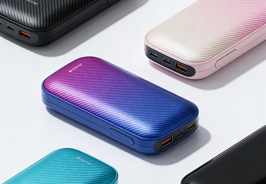
Core design tips: adopt medium and high saturation colors in preliminary color matching to reserve margin for molding color difference. For dark color systems, add pearlescent and fine flash textures to avoid dull and monotonous pure black effects. For light color systems and Macaron colors, control ink thickness to prevent light transmission and hollow visual effects. Meanwhile, control the transition range of gradient and color-blocking colors to avoid color fault and blurring caused by injection stretching, so as to achieve a transparent, premium and layered color effect.
3. Graphic Layout: Avoid Process Blind Zones to Ensure Clarity
Fine graphics and texts such as product logos, parameter texts and functional identifiers are key details of IMD design. Tiny characters and thin line patterns should avoid mold parting surfaces and exhaust grooves to prevent ink breakage, blurriness and incompleteness after molding. In addition, the spacing between graphics and texts should not be too dense, so as to avoid ink accumulation, adhesion and blackening, ensuring clear and exquisite identifiers with both aesthetics and practicality.
4. Texture Superposition: Multi-process Mixing to Improve Product Grade
To break the limitation of single texture, IMD multi-layer texture mixed design can be adopted, such as "frosted base + bright surface pattern", "wood grain base + metal brushed line", "pearlescent base color + laser gradient light and shadow". The superposition of multiple textures and colors creates a rich layered visual effect, completely eliminates the cheap sense of plastic products, and fits the design positioning of mid-to-high-end products.

Leave your message